Transformers: Drift in 3D!

A couple of years ago a good mate of mine, Transformers writer Shane McCarthy came up with a new Autobot character for a minor role in IDW's All Hail Megatron comic book series. He was called Autobot Drift and was in part a homage to the japanese origins of transforming toys. Shane worked with the series artist, Guido Guidi on coming up with Drift's look (see his initial designs here) My small contribution as the resident petrol-head was to suggest that the drift car he transform into be a Nissan Silvia S15.

As is the norm with this type of work, the editors at IDW Publishing and Hasbro, the owners of the Transformers franchise needed to approve the inclusion before publication. From what I can tell, the marketing types got a bit excited. Okay, they got a lot excited. So excited that they decided "We're going to make this into a toy!"

So two years later, I find myself driving around to various toy stores all around Perth trying to find Autobot Drift (apparently there are Transformers collectors at Ozformers who keep track of this stuff - handy!). I managed to find one in Toyworld Claremont. Being Claremont I'm sure they added an extra 50% to the price, because, it's Claremont.

It was pretty surreal to see a 3D realisation of Shane & Guido's character there on the shelves in real life. I get the same kind of surreal buzz seeing my own design work in print.

The actual Drift toy is remarkably close to Guido's comic book design. The Hasbro designers have done a remarkable job for what must have been a complex engineering task. I was also really impressed by the pose-ability of the character and you can style some pretty neat poses when Drift brandishes his two-handed sword. Yes, Drift has three swords. It's doesn't get much more awesome, unless of course they were lightsabres. Or maybe flaming lightsabres... but I digress.

My one criticism probably says more about me than the toy, but transforming these toys seems so much more difficult than I remember.

When I was a kid you just folded them in half.

Oh, and Drift has a new comic mini-series coming out.

Top 5 Job Application Tips for Graphic Designers

Earlier today as part of my regular job I was reviewing job applications for a Senior Graphic Designer position. While some of the applications were quite decent, there were so many bad ones that I gained a LOT of insight into what NOT to do when applying for a graphic design position. There were 20+ applications to sort through and I was surprised at how many made it so easy for me to eliminate them from the running. So to help prevent aspiring graphic designers out there from making these same mistakes, I thought I’d present my top 5 job application tips! All of these were based on actual employment applications I reviewed! Amazing!

1. Check your spelling.

Especially paragraphs where you write about how much experience you have at proofing things for print. I kid you not!

2. Don't set your resume in Arial.

Good designers should be aware of the message their typeface choices send. Arial is clean, modern and legible typeface, yes, but it’s also a weak default option. Choosing Arial just shows me how design-ignorant you are. Out of all the other great options there are out there, you chose a default font in Microsoft Word, and a much derided one at that.  (Exception: email applications: your choices are limited here.)

3. Leave out the fluffy stuff.

“I’m a forward-thinking success-motivated individual who seeks out dynamic interpersonal... blah blah blah…” NEXT.

4. Show me your work.

At least give me a link to some of your work online or include some portfolio pieces within a PDF. Your resume might read really well, but that doesn’t convince me you have a good eye for design. Oh, and if you do have a website portfolio showing your work, make sure the site isn’t completely broken.

5. Consider the content of your portfolio.

Don’t fill up your portfolio with weaker projects. It looks better to show 5 strong examples than 35 questionable ones. Where possible, explain your role in each project. Did you design that logo, or just put it on a red background and make it into a banner? Did you design and code your website from scratch, or apply your logo to a template? Thought processes and design rationales are excellent, just keep them concise.

And... maybe it’s best that you leave out that uni project you did for amphetamine product packaging. I’m sure it was really cool for your classmates, but now I can’t help but think you’re going to steal our laptops to pay for your meth.

Remember that this is all about convincing me that you’re effective at visual communication. The best thing you can do is imagine yourself in the place of the interviewer and consider all the messages your job application sends.

Okay, now go out there and land that design job!

Rare Transformers Covers

On of the perks of designing cover art for comic book publishers like IDW is receiving complimentary copies of the comics you worked on.

With IDW I usually get two copies of the regular comic, and as in the case of Transformers: Last Stand of the Wreckers, where they print a limited run of variant covers based on my artwork, two copies of the variant covers.

wreckers_5_RI_covers-940x408.jpg

The variant covers (pictured) for this series are my regular cover design minus the titles and other cover markings, printed on better paper with a matt varnish finish. The matt varnish feels really slick, although it reduces the blackness of the dark areas in the design, so tends to work better for designs that are lighter or more saturated. I design my covers with the titles in place as I believe that they are a fundamental part of the finished cover design, so sometimes this can leave a bit of an unbalanced space at the top when the titles are removed. But overall I think the variants are pretty neat to have. The rareness of them is an extra bonus!

I haven’t read LSotW all the way through yet (although I did read the script many months ago) but I’m looking forward to it. From all accounts this series has been really popular, particularly with the die-hard Transformers fans. I like this approach from IDW. They seem to be mixing accessible storylines that make it relatively easy for new readers to jump on board, with mini-series and single issue stories tailored for the hardcore fans.

I have some more IDW cover work coming up, but as with these things, nothing I can talk about just yet, sorry!

The T Party

Okay, so I don’t really consider myself one of those guys that dress up as their favourite sci-fi character at conventions or halloween, (or just for fun) but yes, I made an Optimus Prime costume. Out of cardboard. I recently had my (35th) birthday and held a dress up party to celebrate. My friends are a creative bunch, so I pitched it as a “dress as something starting with the letter T” Party.

The problem with holding a fancy-dress party is that as the host, you have to put in a big effort (yes, it’s in the hosting-a-party rules). So after briefly considering going as The Terminator, or a taxman, or a tennis player, the obvious choice became a Transformer.

And of course, if you’re going as a Transformer, there’s none more well-known or admired than Autobot leader and all-round nice bot Optimus Prime.

We started by raiding the cardboard bins outside a local shopping centre. They were located in a secure area so I sneaked in to find the bits I needed only to be surprised by a security guard. Fortunately she was only happy to help, and invited us to take as much as we wanted!

From there we sourced some cheap cricket gloves, some Milo tins, some card, glue, and acrylic paint from a craft store, flower pot stands, flashlightsand ice cube trays from a $2 shop, some velcro and elastic, and last but importantly, I borrowed a friend's cricket helmet.

So with the help of my gal and a helpful friend, we spent a day painting, cutting and taping. I drew up the windows in Adobe Illustrator, and printed them out along with the the Autobot logos previously supplied to me by IDW Publishing.

It was a lot of work, but I was pretty pleased with the finished costume. I must say though, I didn’t think far enough ahead to realise that when you’re wearing it, you can’t drink or eat unassisted: kinda important at a party!

And before you ask, no, it doesn’t transform... unless you count transforming from a costume back into a pile of boxes.

Yes, this makes me a geek.

We Will Bury You #3 out now!

“We Will Bury You” issue 3 from IDW Publishing is in comic stores today! It’s got zombies, is set in 1920s New York, and features my cover design – Awesomeness! The series is written by Heroes actress Brea Grant and her brother Zane and drawn by Kyle Strahm. So far the reviews have been pretty positive.

This was my first non-Transformers cover for IDW, and it was slightly daunting to be following Ben Templesmith and Eisner winner Nate Powell on cover duties. The brief was to to do it as a mock 1920s movie poster and I had a lot of fun researching styles, layouts and techniques of the era.

Look for it in your local comic book store!

Happy Birthday Duke

Duke Ellington and I share a birthday today, so to celebrate, here's a look at how records (remember them?) were made in the 1930s with Duke Ellington's Orchestra performing Oh Babe, Maybe Someday with Ivie Anderson. "Electrically engraved with the world's finest entertainment!".

Happy Birthday Duke!

Home of Tomorrow!

This was the home of the future, according to a 1956 newspaper illustration.

Okay, so maybe we don't all land a helicopter on the roof, and you probably shouldn't be smoking that pipe indoors, but much of this is spot on. Big flat-screen wall-mounted TV, dishwasher, microwave, modernist architecture... and I'm pretty sure that's an iMac on the right!

Via Googie Architecture Online

Hutchison-McCarthy Animation Studios

Here’s a rare look behind the the scenes at Hutchison-McCarthy Animation Studios. Those hilarious characters you know and love are all products of the imagination of these hard-working fellows. Wacky!

Okay, so we’re not opening an animation studio. Last weekend my buddy and fellow Transformers colleague Shane McCarthy and I attended a Disney themed party. So instead of going as the usual Mickey, Prince Charming, Tigger or Mad Hatter we went as... wait for it... “Disney Animators from the Golden Era of Animation”.

Now to effectively pull off our “Golden Era Animator” costumes we needed props. We had the sweater vests, the rolled sleeves, slicked hair and spectacles taken care of, but to really sell it we needed more. We found some clipboards and a few sheets of animation tracing paper. I then redrew (okay, there might have been some tracing involved) a Fred Moore sketch from All The Cats Join In and a fake character reference sheet for Walt Disney’s early Oswald the Lucky Rabbit character (obscure enough?).

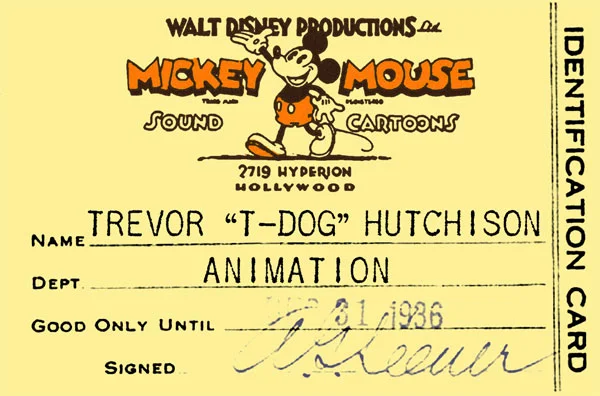
I also was able to track down (through the joys of Google) a 1930s Walt Disney Productions identification card. I enlarged and cleaned it up in Photoshop and then added in our own names in an old typewriter font to make our very own Disney ID cards which we attached to lanyards.

I think it made a nice change from all the Alice in Wonderland costumes. That, and nobody needs to see me in a blue dress.

A walk down Cloudstreet

Yesterday I had a bit of fun as an extra in a television miniseries. An adaption of Tim Winton’s novel Cloudstreet, set in 1940s Perth, is currently being filmed and I answered the call for retro looking dudes who could bust a few dance moves.

Dapper gents?

Dapper gents?

It was a long day which started with hair, makeup and costuming. To make things easier I brought my own 1949 vintage suit, which I was fortunate to find in mint condition in a vintage clothing store in Sydney last year. It was perfect for the period and amazingly fits like a glove! There were about 20 extras in the scenes we were shooting and some serious transformations took place. The gents all looked quite dapper and the ladies were all stunning. If only people made the same effort these days!

Preparing the extras

Preparing the extras

We had two scenes. The first was set in a crowded restaurant, where were had fun miming fake conversations in the background and walking through the scene. Sounds pretty easy, hey? But when the scene lasts several minutes and there are multiple takes and multiple cameras, it becomes quite a challenge to repeat your movements exactly each take and time them with the actors’ dialogue. We had an assistant director that was very helpful cuing us and hair and makeup people fussing over us throughout.

The second scene was a dance scene set in the “Embassy Ballroom” We partnered up and pulled out our best moves, all the time being careful not to hip-and-shoulder the lead actors; Emma Booth and Oliver Ackland . There was a mix of experienced dancers and non-dancers which I think will add some nice authenticity. We were asked to dance as quietly as possible (the music was turned right down to allow the recording of the actors lines) so no big stomps!

Cloudstreet dance scene filming

We finished off the night by recording the background noise for the previous restaurant scene. We basically talked nonsense for 4 minutes while they recorded us! I think I said something about feeding the dog lobster, so listen out for that! (might wanna turn the volume up, like WAAAY up!)

All in all, a fun day and it’s nice to get way from the computer screen. If all goes well, my elbow might make the final cut.

House Party

Aside from producing fabulous fonts, like those found in their latest Eames collection, House Industries make the most over-produced, over-the-top, yet beautiful print catalogs. They are one of my favourite design studios and I always look forward to seeing what they do next.

Galerie Montmartre

One day, when I find myself with a bunch of spare cash lying around, I'm going to pop over to Galerie Montmartre and pick up an authentic vintage poster such as this. In the meantime I'll just have to be satisfied geeking out at their online collection.

Get Shorpy

I could spend all day looking at the marvellous vintage photograph collection on Shorpy. Make sure you check out the eye-popping colour Kodachromes. They look like they were taken yesterday!

Jessica Hische exhibition in Melbourne

I’ve been admiring the work of NY based typographer, designer and illustrator Jessica Hische from afar for a while now, but last weekend whilst on a short visit to Melbourne I was excited to able to catch an exhibition of her excellent typography work in person. The exhibition was pretty small (let’s say bedroom–sized). But I really enjoyed geeking-out at her detailed lettering up close. There’s a definite retro-ness to her work (perhaps that should be “respect for typographic history”?) and it's super-playful.

I picked up a limited edition print which will be sure to get the framing treatment and go straight to the pool room.

More internettings of Jessica here.

Prime Wallpaper

I get lots of requests for this, so finally: desktop wallpaper! Optimus Prime from my cover to IDW Publishing’s All Hail Megatron, #9.

Download it now! This link will download a ZIP file containing wallpapers for the 7 most popular screen resolutions: 1920 x 1200 | 1920 x 1080 | 1680 x 1050 | 1440 x 900 | 1280 x 1024 | 1280 x 800 | 1024 x 768

Think of it as compensation if you missed out on a signed cover book!

Casarramona

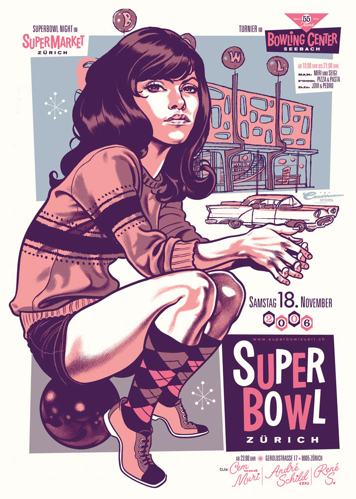
One of my favourite contemporary illustrators is Zürich-based designer Michel Casarramona. He makes fantastic use of caricature, custom typography and colour, and wraps it in retro-inspired goodness. Like.

Vintage concert poster design

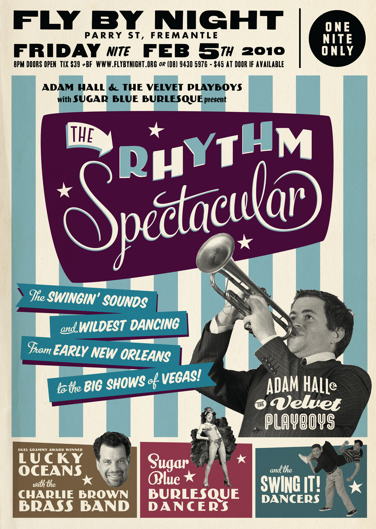
I’ve designed a few concert posters recently based on a vintage “tour blank” style of poster. But what is this style?

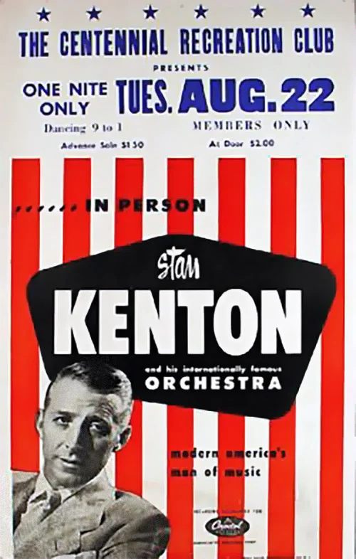
In the US from the 1920s to the 1960s, touring musicians commissioned eye-catching poster designs to promote their upcoming tours in a style shown in the examples below.

Determined to grab your attention, the designs were bold. Usually 2 or 3 bright colours were used along with arrows, circles, stars and stripes to direct the eye. As was the process of the day, the type was generally hand-lettered. Most of these designs used publicity photos of the artists, often using just their heads cut out from the background (alternatively, a caricature would be used).

It would have been expensive to produce a separate poster design for each of the destinations on their tour, so they would print a generic poster and leave a blank space (usually at the top) to add specific venue information at a later date. This venue information was printed (usually by letterpress) locally by the promoter. Sometimes the information was simply drawn on to each poster by hand. As a consequence the part with the venue information has a more amateurish appearance than the rest of the poster, which I tried to replicate with my modern interpretations.

I tried out some letterpress printing using wood type recently at the Melbourne Museum of Printing. I’ll go into more detail in a later post, but if you are a student of graphic design it is a visit I definitely recommend!

It’s worth noting that nowdays these “tour blank” concert posters are sometimes identified as “boxing style”.

Check out these posters advertising touring multi-act “revue” style shows! Now that’s a busy poster design! (but they sure look like fun concerts!)

Special thanks to Dr. Dennis Hickey for permission to use images from his fantastic poster collection. If you’d like to learn more check out his vintage concert poster collecting website. I also recommend Pete’s Poster Central site for more information on vintage tour blanks.

Shout and Feel It

Just a quick thank you to all of you who posted the kind comments on my welcoming post. I was hoping that I’d get maybe 10 people come and say hi, so it’s pleasing to see currently more than 70! I don’t have that many relatives so I guess there are people out there who are actually keen to win a signed Transformers cover art book!

artoftrevorhutchison

I’ll be randomly selecting 5 winners on March 12th, so if you haven’t said “Hi” yet there's still time! Tell your friends!

I’d also like to give a quick shout-out to design blog Australian Edge and Wordpress wizards Graph Paper Press for showcasing my work this week. Thanks guys!

The making of a comic book cover

To launch my new website and blog, I’ll be posting a few articles exploring my design process. Let me know if you’d like to see more of this kind of thing!

In the image above you can see the technique and creative process I used to construct one of my covers for IDW’s Transformers: All Hail Megatron.

I started with a basic sketch to put what was in my head on paper. [spoilers] This issue (AHM#9) featured the return of Autobot leader Optimus Prime, so I wanted something that would depict the return of the heroic leader. One of the overriding themes of All Hail Megatron was the concept of leadership; both different styles of leading and characters’ reactions to lack of, failure of, or objectionable leadership. To hint at this I used a propaganda style on many of the covers.

You can see this kind of defiant hero pose in these WWII propaganda posters:

propaganda.jpg

Once I had the concept down on paper I began constructing the basic shapes of Optimus Prime in Adobe Illustrator. You can see that his stance and details evolved from the sketch.

Once I had the basic shapes and silhouette I pasted it into Photoshop and added the basic lighting and more detail. I reworked some of the shapes to better suit the composition of the page. One of the ideas I was keen to use was to have Prime blocking part of the title of the comic “All Hail Megatron” - an act of defiance against Megatron. (A second title was ultimately added in editing to make sure the comic’s title was clearly legible.)

The final step was to apply shading and textures which were sourced from scans of spray paint textures. I wanted the rough texture because it was closer to the style of many of the mid-century posters which were often airbrushed. You can get a sense of the texture in the detail shown below:

I made a late decision to turn his head to face away from the viewer because I felt he appeared stronger this way. Each artist has a different approach to drawing the characters. To illustrate my version of Optimus Prime I referenced Primes drawn by regular Transformers artists E.J Su and Guido Guidi but stylized the features and proportions to suit the style of the cover.

This cover for All Hail Megatron #9 was included in Comic Book Resources (CBR’s) 50 best covers of 2009